Better Google Sites Design–The Notched Page
2015-03-04 14:38
I am not a web designer. Lest that be unclear, let me call it out.
I am not a web designer
But, I can imitate, and I can figure things out. Except programmable thermostats. Baffling.
It’s no secret that Google Sites themes are uniformly mediocre. I went searching for tutorials on how to do better, and found some help—not much—and a company, Kirksville Web Design, who specializes in them. This was a pretty big help, because I got to look at actual sites that I knew could be done in GS. I could either pay them for templates, or figure it out.
This isn’t a tutorial on how to use Google Sites, nor on how to create web images. I’m assuming you know enough about both. (I use Inkscape to create a lot of my graphics.)
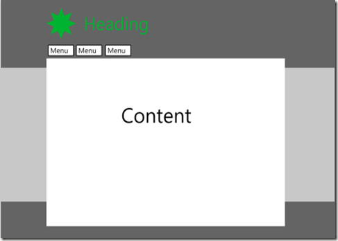
Now, if you want a really professional site, hire a professional designer like Kirksville. But if you want a decent looking site, here are instructions for creating a simple, better design. The reference web site—again, designed by Kirksville—is Aim for ‘A’. The basic layout features a notched design.
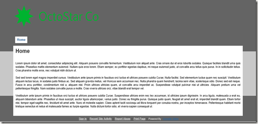
That’s not so attractive, but the final site I created is.
Initial Setup
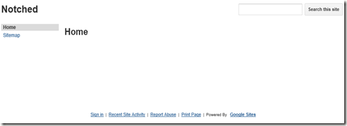
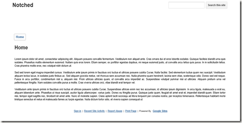
Create a Google Site (GS) with a blank template and the Blank Slate theme. You’ll get a pretty ugly page.
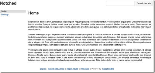
Edit the page and add some text.
Now we’re ready to edit the Site Layout
Site Layout
- Only activate Header and Horizontal Navigation (deactivate Sidebar). Set Site Width to Custom 1000px (press Enter in this text box to save the setting).
- Click the Header to edit, and set height to 130px. This is what gives the upper notched effect. Less height increases the notch.
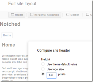
- Click the Close button. This gives us a centered site.
Now, choose Manage Site.
Manage Site
In the General page,
- Uncheck Show Site Name at Top of Pages
- Click Configure Search. Uncheck “Enable Search.” This gets rid of the search box.
- Under Mobile: Check Automatically Adjust Site to Mobile Phones
- Save
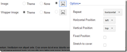
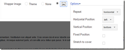
Now open the Themes, Colors, and Fonts page. For the header and footer, you’ll need the following. I used png files, but you could use jpg or gif as desired.
- A single-color image 1px wide by 200px high, named header-background.png. I chose color #646464.
- A single-color image 1px wide by 100px high, named footer-background.png.I chose color #646464.
- A header/logo image 1000px wide by 130px high, named header.png. I made the image’s background color #646464 to match the header color. A more advanced (and better) technique is to surround the logo/text with a transparent box only as big as needed, to save download size.
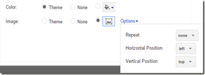
Make these changes.
- Entire Page
- Site header
- Content area
- Background color: white
- Save.
Et voila!
There’s clearly more that should be done to make this attractive, but this gives you a good start.
More About Headers
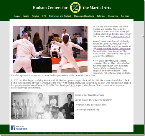
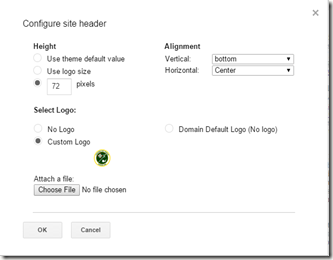
The Hudson CMA web site has a centered logo. I didn’t use a 130x1000 image for this. Instead, I surrounded the logo in a transparent box to give the margins I wanted. Then, instead of adding the logo using Manage Site > Themes, I added it using Site Layout > Header.
One isn’t necessarily better than the other, though they can lead to differences in how the horizontal menu is placed. More on that in another post.
References
Google Sites: Build Your Own Theme
Summit Stuff: Designing Google Sites
GSites Gallery Great inspiration
Google Sites Web Design A site maintained by Kirksville
Site Template If you want to buy templates
