
.NET MAUI Progressing From a Default Project Part 5 - Restyling From Scratch
2022-07-11 19:11
The Series
Level: Moderate
This series assumes the developer is familiar with .NET MAUI, the Model-View-ViewModel pattern, and has worked through one or more tutorials such as the excellent James Montemagno's Workshop.
Source: https://github.com/bladewolf55/net-maui-progression
- Part 1 - Adding the View Model
- Part 2 - (The Problem With) Basic Unit Testing
- Part 3 - Adding the Model
- Part 4 - Putting the View in Its Place
- Part 5 - Restyling From Scratch
- Part 6 - Revisiting Unit Testing
- Part 7 - Deploying, the Other People's Links Edition
What Problem Do Styles Solve?
Fundamentally, styles let you declare in one place how something will look no matter where it appears. A style differs (in my mind) from a format.
Let's consider a button. Here's one with a default format.
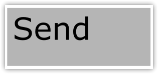
It's grey, square, and uses the host's default sans serif typeface positioned top left. Now let's format the button.
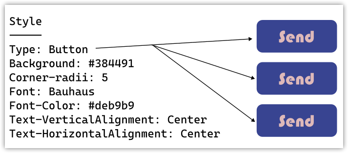
Yes, you're right, some people will say "style" the button. That's OK, I'm drawing a distinction to clarify what styles are. If you prefer, you can think of them later as "named styles." I'll be using the word more casually later on.

Now the button background is blue with rounded corners, the text color is peach with a Bauhaus typeface and centered.
In a larger application, I want to apply the same format to each button automatically instead of manually on each one. That way, if I want to change the background to green I can do it in one place. I do that by creating a style.
This is an application of the Don't Repeat Yourself (DRY) principle.
Styles seem simple, but they get tricky pretty quickly when you want to do things like change a button's style depending on whether it's a Save or Delete (maybe the delete button should be bright red, but otherwise the same as other buttons).
Taken together, styles are part of the application's UI/UX design.
Starting Our Styles Over
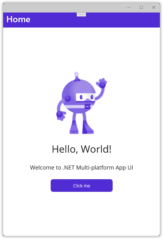
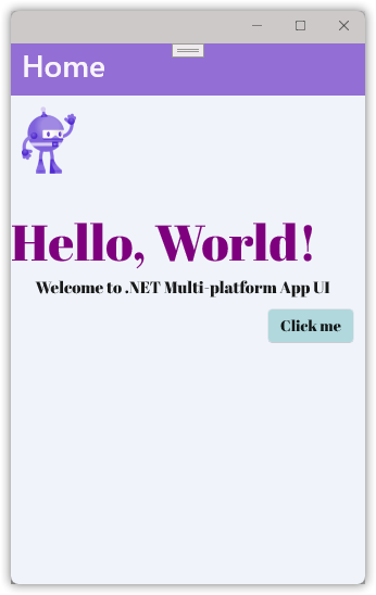
Here's what our app looks like right now.
Let's get rid of all our styles. We'll create new ones later.
In the
Maui.ProgressionprojectResources/Stylesfolder, delete these two files:- Colors.xslt
- Styles.xslt
In
Resources/Fonts, delete both OpenSans .ttf files.Open
App.xamland delete the Application.Resources node, leaving you with this.<?xml version = "1.0" encoding = "UTF-8" ?> <Application xmlns="http://schemas.microsoft.com/dotnet/2021/maui" xmlns:x="http://schemas.microsoft.com/winfx/2009/xaml" xmlns:local="clr-namespace:Maui.Progression" x:Class="Maui.Progression.App"> </Application>Open
MauiProgram.csand delete these lines..ConfigureFonts(fonts => { fonts.AddFont("OpenSans-Regular.ttf", "OpenSansRegular"); fonts.AddFont("OpenSans-Semibold.ttf", "OpenSansSemibold"); });leaving this
public static MauiApp CreateMauiApp()
{
	var builder = MauiApp.CreateBuilder();
	builder
		.UseMauiApp<App>();

	builder.Services.AddSingleton<INumberMapper>(new NumberMapper());
	builder.Services.AddSingleton<Counter>();
	builder.Services.AddSingleton<MainPage>();

    return builder.Build();
}
Edit
Maui.Progression.csprojand comment out the MauiFont Include line.
		<!-- Custom Fonts -->
		<!--<MauiFont Include="Resources\Fonts\*" />-->
- Open
MainPage.xamland replace with this code. It removes all inline styling.SemanticProperties can be included in styles, but I'm not doing it in this post.
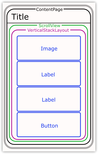
<?xml version="1.0" encoding="utf-8" ?>
<ContentPage xmlns="http://schemas.microsoft.com/dotnet/2021/maui"
            xmlns:x="http://schemas.microsoft.com/winfx/2009/xaml"
            x:Class="Maui.Progression.Views.MainPage"
            xmlns:viewmodels="clr-namespace:Maui.Progression.ViewModels;assembly=Maui.Progression.ViewModels"
            x:DataType="viewmodels:Counter"
            >
    <ScrollView>
        <VerticalStackLayout >
            <Image
                Source="dotnet_bot.png"
                SemanticProperties.Description="Cute dot net bot waving hi to you!" />
            <Label
                Text="Hello, World!"
                SemanticProperties.HeadingLevel="Level1" />
            <Label
                Text="Welcome to .NET Multi-platform App UI"
                SemanticProperties.HeadingLevel="Level2"
                SemanticProperties.Description="Welcome to dot net Multi platform App U I" />
            <Button
                Text="{Binding CountText}"
                SemanticProperties.Hint="Counts the number of times you click"
                Command="{Binding IncreaseCounterCommand}" />
        </VerticalStackLayout>
    </ScrollView>
</ContentPage>
Weirdness
I found the app still runs even if the font files are deleted and the.ConfigureFontsmethod is still in place. Maybe that's intentional, but I'd have expected a compile error.
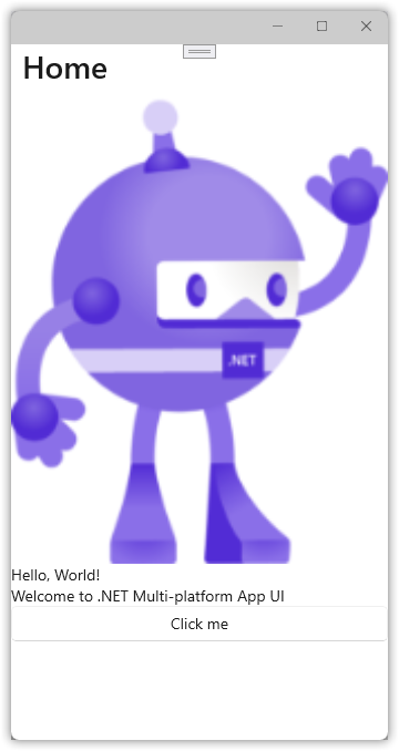
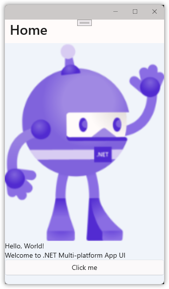
Run the app. It looks pretty horrific, but still works.
What Are Our Elements?
We're going to style our app, but what can we style? Just like on the web, a page is made up of elements in a layout.
All of these elements can be styled. That is, they all have a Style property that can be set to a named style. Setting the element's properties overrides the style.
We can think of our layout as a set of containers. Styles are inherited, meaning inner elements (usually) get the same formatting as the outer elements unless overridden.
We're going to progressively style our app's elements, and then add a button with some overrides.
The Hard Way
But first, let's format each element separately, starting with the content page. Add a BackgroundColor to MainPage.xaml.
<ContentPage xmlns="http://schemas.microsoft.com/dotnet/2021/maui"
             xmlns:x="http://schemas.microsoft.com/winfx/2009/xaml"
             x:Class="Maui.Progression.Views.MainPage"
             xmlns:viewmodels="clr-namespace:Maui.Progression.ViewModels;assembly=Maui.Progression.ViewModels"
             x:DataType="viewmodels:Counter"
             BackgroundColor="AliceBlue"
             >
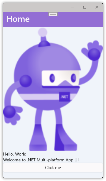
As expected, this changes the background to a pale blue.
Note a couple of things.
- The button background is white. That's because it's not transparent like the labels.
- The title background is still white. Why is that?
Our app is using the Shell App method for laying out the overall content, which includes the title element.
Think of App Shell as the overall container for your app that all pages inherit from.
Open AppShell.xaml and format the Shell.BackgroundColor and Shell.TitleColor.
<?xml version="1.0" encoding="UTF-8" ?>
<Shell
    x:Class="Maui.Progression.AppShell"
    xmlns="http://schemas.microsoft.com/dotnet/2021/maui"
    xmlns:x="http://schemas.microsoft.com/winfx/2009/xaml"
    xmlns:local="clr-namespace:Maui.Progression.Views"
    Shell.FlyoutBehavior="Disabled"
    Shell.BackgroundColor="MediumPurple"
    Shell.TitleColor="GhostWhite"
    >
    <ShellContent
        Title="Home"
        ContentTemplate="{DataTemplate local:MainPage}"
        Route="MainPage" />
</Shell>
Note this is also where the default page Title is set.
Also, these same properties can be set in a view's ContentPage element. So, each page could have a different title color. Whimsy.
Here's the result. (No one ever said I'm good with colors.)
Back to MainPage.xaml and well finish our manual formatting.
<?xml version="1.0" encoding="utf-8" ?>
<ContentPage xmlns="http://schemas.microsoft.com/dotnet/2021/maui"
             xmlns:x="http://schemas.microsoft.com/winfx/2009/xaml"
             x:Class="Maui.Progression.Views.MainPage"
             xmlns:viewmodels="clr-namespace:Maui.Progression.ViewModels;assembly=Maui.Progression.ViewModels"
             x:DataType="viewmodels:Counter"
             BackgroundColor="AliceBlue"
             >
    <ScrollView>
        <VerticalStackLayout>
            <Image
                Source="dotnet_bot.png"
                SemanticProperties.Description="Cute dot net bot waving hi to you!"
                WidthRequest="50"
                HorizontalOptions="Start"
                Margin="10,10,0,30"/>
            <Label
                Text="Hello, World!"
                SemanticProperties.HeadingLevel="Level1"
                FontSize="Header"
                TextColor="Purple"
                FontFamily="AbrilFatface"/>
            <Label
                Text="Welcome to .NET Multi-platform App UI"
                SemanticProperties.HeadingLevel="Level2"
                SemanticProperties.Description="Welcome to dot net Multi platform App U I"
                FontSize="15"
                HorizontalTextAlignment="Center"
                Margin="0,0,10,10"
                FontFamily="AbrilFatface" />
            <Button
                Text="{Binding CountText}"
                SemanticProperties.Hint="Counts the number of times you click"
                Command="{Binding IncreaseCounterCommand}"
                HorizontalOptions="End"
                Margin="0,0,10,0"
                BackgroundColor="#b0dce1"
                FontFamily="AbrilFatface"/>
        </VerticalStackLayout>
    </ScrollView>
</ContentPage>
Run the app to get this admittedly ugly user experience, but one that demonstrates some features.
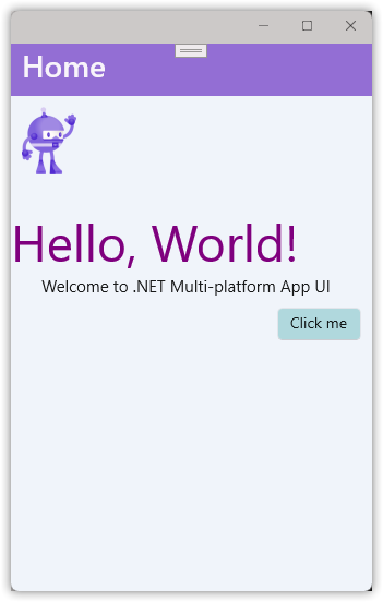
Our changes are working except for the font. That's because we need to explicitly load that font resource.
- Download the Abril Fatface font from Google. (Or use some other font file of your choice.)
- Unpack and copy the files into the
Resources\Fontsfolder. - In
Maui.Progression.csproj, uncomment this line to include any font files in the Fonts folder in the app build.<MauiFont Include="Resources\Fonts\*" /> - In
MauiProgram.csadd this code to register the font file and give it a friendly name.builder .UseMauiApp<App>() .ConfigureFonts(fonts => { fonts.AddFont("AbrilFatface-Regular.ttf", "AbrilFatface"); });
Restart the app to see the change.
Page-Level Styles (Ending With Inheritance)
We can format at the lowest level: individual elements. Let's create some styles at the page level.
In MainPage.xaml, add a ContentPage.Resources node with the following.
<ContentPage.Resources>
    <Style x:Key="page" TargetType="ContentPage">
        <Setter Property="BackgroundColor" Value="AliceBlue" />
    </Style>
</ContentPage.Resources>
Replace the ContentPage BackgroundColor="AliceBlue" property with a Style property.
<ContentPage xmlns="http://schemas.microsoft.com/dotnet/2021/maui"
             xmlns:x="http://schemas.microsoft.com/winfx/2009/xaml"
             x:Class="Maui.Progression.Views.MainPage"
             xmlns:viewmodels="clr-namespace:Maui.Progression.ViewModels;assembly=Maui.Progression.ViewModels"
             x:DataType="viewmodels:Counter"
==>          Style="{StaticResource page}"
Try running the app. Here we run into an irritating error.
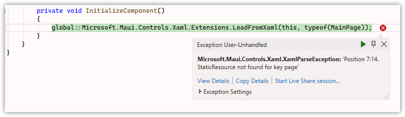
Maybe I'm missing something, but it appears we can't define a ContentPage style for the content page we're in. Harrumph!
Undo both changes above. We can create ContentPage styles, but we'll do it later when we move our styles to the application.
For now, add this ContentPage.Resources block instead.
    <ContentPage.Resources>
        <Style TargetType="Label">
            <Setter Property="FontFamily" Value="AbrilFatface"/>
        </Style>
        <Style TargetType="Button">
            <Setter Property="FontFamily" Value="AbrilFatface"/>
        </Style>
    </ContentPage.Resources>
In each label and the button, delete the FontFamily="AbrilFatface" attribute, then rerun the app, which should look the same as before. All we've done is create a couple of styles that say "If you display a label or a button, use the AbrilFatface font." You can prove it works by changing the FontFamily name to something else such as "Consolas" (on Windows).
These are implicit styles. They're applied to elements that match the TargetType exactly.
Note
But not to elements derived from the TargetType unless ApplyToDerivedTypes = True. See Microsoft's documentation (linked in Resources) for more details.
Let's convert these to explicit styles. We do that by setting the x:Key attribute.
<ContentPage.Resources>
    <Style x:Key="baseLabel" TargetType="Label">
        <Setter Property="FontFamily" Value="AbrilFatface"/>
    </Style>

    <Style x:Key="baseButton" TargetType="Button">
        <Setter Property="FontFamily" Value="AbrilFatface"/>
    </Style>
</ContentPage.Resources>
Since we've given our styles keys, we need to explicitly use them by using the Style attribute.
<Label
    Text="Hello, World!"
    SemanticProperties.HeadingLevel="Level1"
    FontSize="Header"
    TextColor="Purple"
    Style="{StaticResource baseLabel}"
    />
<Label
    Text="Welcome to .NET Multi-platform App UI"
    SemanticProperties.HeadingLevel="Level2"
    SemanticProperties.Description="Welcome to dot net Multi platform App U I"
    FontSize="15"
    HorizontalTextAlignment="Center"
    Margin="0,0,10,10"
    Style="{StaticResource baseLabel}"
        />
<Button
    Text="{Binding CountText}"
    SemanticProperties.Hint="Counts the number of times you click"
    Command="{Binding IncreaseCounterCommand}"
    HorizontalOptions="End"
    Margin="0,0,10,0"
    BackgroundColor="#b0dce1"
    Style="{StaticResource baseButton}"
    />
Now let's build on this by defining two label styles that inherit from baseLabel.
Important
Per Microsoft, "An implicit style can be derived from an explicit style, but an explicit style can't be derived from an implicit style."
<Style x:Key="baseLabel" TargetType="Label">
    <Setter Property="FontFamily" Value="AbrilFatface"/>
</Style>
<Style x:Key="header" TargetType="Label" BasedOn="{StaticResource baseLabel}">
    <Setter Property="FontSize" Value="Header"/>
    <Setter Property="TextColor" Value="Purple"/>
</Style>
<Style x:Key="greeting" TargetType="Label" BasedOn="{StaticResource baseLabel}">
    <Setter Property="FontSize" Value="15"/>
    <Setter Property="HorizontalTextAlignment" Value="Center"/>
    <Setter Property="Margin" Value="0,0,10,10"/>
</Style>
The formatting can be removed from the labels.
<Label
    Text="Hello, World!"
    SemanticProperties.HeadingLevel="Level1"
    Style="{StaticResource header}"
    />
<Label
    Text="Welcome to .NET Multi-platform App UI"
    SemanticProperties.HeadingLevel="Level2"
    SemanticProperties.Description="Welcome to dot net Multi platform App U I"
    Style="{StaticResource greeting}"
        />
Let's assume our baseButton is going to use all the formatting, not just the font.
<Style x:Key="baseButton" TargetType="Button">
    <Setter Property="FontFamily" Value="AbrilFatface"/>
    <Setter Property="HorizontalOptions" Value="End"/>
    <Setter Property="Margin" Value="0,0,10,0"/>
    <Setter Property="BackgroundColor" Value="#b0dce1"/>
</Style>
Which lets us simplify the button element.
<Button
    Text="{Binding CountText}"
    SemanticProperties.Hint="Counts the number of times you click"
    Command="{Binding IncreaseCounterCommand}"
    Style="{StaticResource baseButton}"
    />
And do the same thing with the image. Why? I've found it's generally a good practice to keep all your styling together, even what seems like one-offs.
Concept
What this helps with is separation of concerns. We're separating out the styling (how elements look) from the semantics (what elements mean), letting us encapsulate our code and improve maintainability.
<Style x:Key="pageImage" TargetType="Image">
    <Setter Property="Source" Value="dotnet_bot.png"/>
    <Setter Property="WidthRequest" Value="50"/>
    <Setter Property="HorizontalOptions" Value="Start"/>
    <Setter Property="Margin" Value="10,10,0,30"/>
</Style>
<Image
    Source="dotnet_bot.png"
    SemanticProperties.Description="Cute dot net bot waving hi to you!"
    Style="{StaticResource pageImage}"/>
Inheritance is nice and all, and tempting, but let's redo our styles to use what's often more powerful: composition through classes.
Styling With Class(es)
One issue we ran into above is, in order to define named styles for our labels, we needed to inherit from a named base style.
Comparison
That's not the way it works in Cascading Style Sheets (CSS), where you can define styles for all label tags, then named styles that override those styles (using either an id or class identifier).
When we use inheritance, we're stuck with whatever styles we defined in the base style. We can override those styles, but not remove them.
If we use classes, we can define characteristics or behaviors that we're styling for, define small, discreet sets of styles, and combine them. For example, maybe all labels have a blue background ("normal"), some get a bold font ("strong"), others get a large font size ("big"). Using classes, we could style a label as "normal strong", "normal big", or "normal strong big".
In our case, we're going to replace our inherited label styles with class-based styles, just to prove it works.
Remove/replace the x:Key attributes as shown.
<Style TargetType="Label">
    <Setter Property="FontFamily" Value="AbrilFatface"/>
</Style>
<Style Class="header" TargetType="Label" >
    <Setter Property="FontSize" Value="Header"/>
    <Setter Property="TextColor" Value="Purple"/>
</Style>
<Style Class="greeting" TargetType="Label">
    <Setter Property="FontSize" Value="15"/>
    <Setter Property="HorizontalTextAlignment" Value="Center"/>
    <Setter Property="Margin" Value="0,0,10,10"/>
</Style>
Update the label elements to use the StyleClass attribute.
<Label
    Text="Hello, World!"
    SemanticProperties.HeadingLevel="Level1"
    StyleClass="header"
    />
<Label
    Text="Welcome to .NET Multi-platform App UI"
    SemanticProperties.HeadingLevel="Level2"
    SemanticProperties.Description="Welcome to dot net Multi platform App U I"
    StyleClass="greeting"
    />
Restart the app and it should look the same as before.
Important
There's a downside to using classes. You can't interactively change style values while the app is running, because the changes aren't supported by Hot Reload. This is unfortunate, because using classes is really valuable and the friction might make developers shy away from them.
Movin' On Up! Using Global Styles
The next level up for styles is the Application. Here you define styles used throughout your pages. It's where you should expect most of your styles to live.
Cut the entire ContentPage.Resources node from MainPage.xaml and paste it into App.xaml inside the Application node. Then rename it to "Application.Resources".
<?xml version = "1.0" encoding = "UTF-8" ?>
<Application xmlns="http://schemas.microsoft.com/dotnet/2021/maui"
             xmlns:x="http://schemas.microsoft.com/winfx/2009/xaml"
             xmlns:local="clr-namespace:Maui.Progression"
             x:Class="Maui.Progression.App">
    <Application.Resources>
        <Style x:Key="pageImage" TargetType="Image">
            <Setter Property="Source" Value="dotnet_bot.png"/>
            <Setter Property="WidthRequest" Value="50"/>
            <Setter Property="HorizontalOptions" Value="Start"/>
            <Setter Property="Margin" Value="10,10,0,30"/>
        </Style>
        <Style TargetType="Label">
            <Setter Property="FontFamily" Value="AbrilFatface"/>
        </Style>
        <Style Class="header" TargetType="Label" >
            <Setter Property="FontSize" Value="Header"/>
            <Setter Property="TextColor" Value="Purple"/>
        </Style>
        <Style Class="greeting" TargetType="Label">
            <Setter Property="FontSize" Value="15"/>
            <Setter Property="HorizontalTextAlignment" Value="Center"/>
            <Setter Property="Margin" Value="0,0,10,10"/>
        </Style>
        <Style x:Key="baseButton" TargetType="Button">
            <Setter Property="FontFamily" Value="AbrilFatface"/>
            <Setter Property="HorizontalOptions" Value="End"/>
            <Setter Property="Margin" Value="0,0,10,0"/>
            <Setter Property="BackgroundColor" Value="#b0dce1"/>
        </Style>
    </Application.Resources>
</Application>
That's . . . it. The app runs the same as before.
Let's deal with something from earlier, though. Remember our content page background color? We can create a style for content pages here. Add the following.
<Style TargetType="ContentPage">
    <Setter Property="BackgroundColor" Value="AliceBlue"/>
</Style>
Back in MainPage.xaml, delete the ContentPage BackgroundColor attribute.
<ContentPage xmlns="http://schemas.microsoft.com/dotnet/2021/maui"
             xmlns:x="http://schemas.microsoft.com/winfx/2009/xaml"
             x:Class="Maui.Progression.Views.MainPage"
             xmlns:viewmodels="clr-namespace:Maui.Progression.ViewModels;assembly=Maui.Progression.ViewModels"
             x:DataType="viewmodels:Counter"
-> DELETE    BackgroundColor="AliceBlue"
             >
Rerun the app and you should still see a blue background.
But you don't! Why not? Because our pages are derived from ContentPage, which isn't obvious. The solution?
<Style TargetType="ContentPage" ApplyToDerivedTypes="True">
    <Setter Property="BackgroundColor" Value="AliceBlue" />
</Style>
Now the background shows as expected.
Take Your Styles Outside, Young Man
If you've worked with web sites, you know that separate style files is a big deal. And, as noted above, it's a good practice. So let's come full circle and pull our styles out into their own file.
- Add a file named
Styles.xamlto theResources/Stylesfolder. - Cut the
Application.Resourcesnode fromApp.xamland paste it intoStyles.xaml. - Rename
Application.ResourcestoResourceDictionary - Replace the top of the file like so.
<?xml version="1.0" encoding="UTF-8" ?>
<?xaml-comp compile="true" ?>
<ResourceDictionary
    xmlns="http://schemas.microsoft.com/dotnet/2021/maui"
    xmlns:x="http://schemas.microsoft.com/winfx/2009/xaml">
Here's the complete file.
<?xml version="1.0" encoding="UTF-8" ?>
<?xaml-comp compile="true" ?>
<ResourceDictionary
    xmlns="http://schemas.microsoft.com/dotnet/2021/maui"
    xmlns:x="http://schemas.microsoft.com/winfx/2009/xaml">
    <Style TargetType="ContentPage" ApplyToDerivedTypes="True">
        <Setter Property="BackgroundColor" Value="AliceBlue"/>
    </Style>
    <Style x:Key="pageImage" TargetType="Image">
        <Setter Property="Source" Value="dotnet_bot.png"/>
        <Setter Property="WidthRequest" Value="50"/>
        <Setter Property="HorizontalOptions" Value="Start"/>
        <Setter Property="Margin" Value="10,10,0,30"/>
    </Style>
    <Style TargetType="Label">
        <Setter Property="FontFamily" Value="AbrilFatface"/>
    </Style>
    <Style Class="header" TargetType="Label" >
        <Setter Property="FontSize" Value="Header"/>
        <Setter Property="TextColor" Value="Purple"/>
    </Style>
    <Style Class="greeting" TargetType="Label">
        <Setter Property="FontSize" Value="15"/>
        <Setter Property="HorizontalTextAlignment" Value="Center"/>
        <Setter Property="Margin" Value="0,0,10,10"/>
    </Style>
    <Style x:Key="baseButton" TargetType="Button">
        <Setter Property="FontFamily" Value="AbrilFatface"/>
        <Setter Property="HorizontalOptions" Value="End"/>
        <Setter Property="Margin" Value="0,0,10,0"/>
        <Setter Property="BackgroundColor" Value="#b0dce1"/>
    </Style>
</ResourceDictionary>
Back in App.xaml, we're going to merge our styles file. If we had more than one file (likely), we'd merge them all this way.
<?xml version = "1.0" encoding = "UTF-8" ?>
<Application xmlns="http://schemas.microsoft.com/dotnet/2021/maui"
             xmlns:x="http://schemas.microsoft.com/winfx/2009/xaml"
             xmlns:local="clr-namespace:Maui.Progression"
             x:Class="Maui.Progression.App">
    <Application.Resources>
        <ResourceDictionary>
            <ResourceDictionary.MergedDictionaries>
                <ResourceDictionary Source="Resources/Styles/Styles.xaml"/>
            </ResourceDictionary.MergedDictionaries>
        </ResourceDictionary>
    </Application.Resources>
</Application>
Rerun the app and, as before, it has our styles.
Wrap Up
We covered a lot, but XAML styles are a much deeper subject and I won't say I've explored its fathoms. Be sure to check out the links below.
Next up: Build (and maybe deployment)!